
Showing posts with label Crit PLZ. Show all posts
Showing posts with label Crit PLZ. Show all posts
Tuesday, October 23, 2012
Complementary palette
Complementaries here being oranges and blues. For this project I wanted the eyes to pop a lot, so I used not only
the complementary blue to all that orange in the skin and hair, but I
also played with the lightness and saturation to make the eyes the focal
point. One more thing I tried to play with in this image was to use a
more textured skin, I’ve been trying to improve my skin tones, which I
think I am doing (though there is a long way to go still!) but so fat
I’ve never really been happy with the textures of my skin. This time it
looks a little better. I think there is a lot to improve and I hope to
some day find the delicate balance between subtlety and texture. As my
first try with this technique, I guess I’ll have to settle in order not
to neglect my other projects.
I might actually revisit the complementary colors topic. I actually envisioned something more eye catching. I can't stand the anatomy of the nose, that got messed up as I was painting it. I will need to do some nose studies, methinks.
 C&C are welcome!

Friday, June 29, 2012
Coty: Palette: Secondary Triad. Crits welcome.
I have had in mind for a while this image and I decided to work with a secondary palette: Green, violet and orange. It really proved to be harder than what I originally thought, and I don’t know how well I did honor the secondary theme, but the final image has the energy I was looking for.
Comments and critiques, always welcome!

That puts my list down by two themes! Yay!
Palettes:
Monochrome
Complementary
Primary
Tertiary
Split complementary
Analogous
Multicolor
Warm
Cold
Composition:
Pyramidal
Spiral
Big group of people
Architecture
one point perspective
two points perspective
Tuesday, June 19, 2012
Angela's Result: Surrounded by Design CRIT PLZ
My result after trying out the "Surrounded by Design" art exercise. My original photo looked like this:

The layered leaves with the color shifting areas caught my eye first. I immediately thought of the ruffles of a dress. The curled leaves in the top right also made me think of underwater kelp. Dress ruffles won out, however, after arranging parts of this photo ended up with the white fronds looking like an Elizabethan collar.
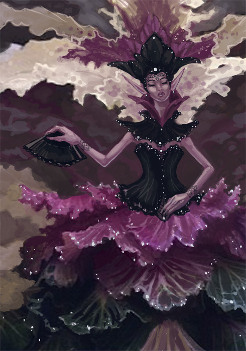
Created in Photoshop CS2 using a Cintiq 12WX.
I'm rather excited by the result! This image went by much faster than my other digital pieces because I had a base for the texture. It could still use some touching up, but I'm otherwise pleased with the spontaneity of coming up with ideas this way!
CRIT PLZ: Her arms feel bare to me. Should I add something more to them? More filigree armbands? Should I add more to the background or does the ambiguous patterns work? Anything else I can do to make this more interesting, should I spruce it up for a portfolio piece?
I hope others try this exercise. It was tons of fun! It's a bit like an artist's Rorschach test. What do YOU see in that shape?
Subscribe to:
Posts (Atom)