Artist Ambition is a self-moderated joint blog for visual artists to improve their work through specific art exercises. Artists post exercise challenges and share the results. Results will be critiqued upon request of each artist.
Read on here for more info on how to participate.
Showing posts with label limited palette. Show all posts
Sunday, July 15, 2012
Restricted colour scheme
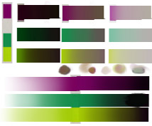
Hello again fellow ambitious peoples! I'm posting this one here now as a finished exercise. I took a cue from Coty's exercise and decided to limit myself to a 3 colour palette. Using some of the guidelines from the Dota2 character art pdf I've got this far with the image! It's now reached the point at which I really want to push it, and using just these three colours is holding me back, so you guys get it as is! Definitely a great exercise to show that colours relevant to each other can still look like stuff like skin, even if the colour on it's own would never look like it. Posting both the image and the palette I put together for it.
Monday, July 2, 2012
Art Exercise - drawing with white media
Ok, so this was not on my list of things to try, but it's an exercise I haven't done since art college days. It's not hugely exciting, or all that revolutionary, but it's dipping my toes back into the traditional media.Normally when I do pencil sketches I draw on white paper, yet when I work digitally I generally start with a grey or midtone background. Even then, I tend to start with a dark 'brush' and add highlights at the end.
So the goal of the exercise was to use white media exclusively on a dark surface. Lines weren't important, nor was shading, the idea was to just break out of the habit of going directly to a dark drawing medium. This was my end result (I wanted to use pen.... but it decided to dry up about 5 lines in *sigh* ... next time!)
Thursday, June 14, 2012
Coty: My challenge list
Hi there! I am Constanza Ehrenhaus, known online also as Faerywitch. I recently posted in my blog that I was challenging myself to grow as an artist and posted a list of things to study and paint. Angela here saw that list and kindly invited me to join her community blog (yay!)
I have already been asked if it is OK to repeat the exercises in this list, and my answer is "Please do! I would love to see your journey too!" So let me share with you my list:
Palettes:
Monochrome
Limited
(Circe)
Complementary
Primary
Secondary
Tertiary
Split complementary
Analogous
Multicolor
Warm
Cold
Why? Because I feel that my coloring could use improving!
Composition:
Pyramidal
Spiral
Big group of people
Architecture
one point perspective
two points perspective
Why? Because my compositions are quite the same, and it's boring.
I decided to keep my submission for the Enchanted Visions Project: Circe, very muted and limited. I chose an earthy palette because I wanted to keep an “ancient” look, and I used a roman inspired frame. Also, I wanted to practice fur, which didn’t come out as good as I wanted, but it is a good first attempt
It was challenging, I hated it for most of the process but towards the end it started to come together. I do like the final look, with the frame in place and the wrinkled texture.
Feel free to critique this piece! :)
I have already been asked if it is OK to repeat the exercises in this list, and my answer is "Please do! I would love to see your journey too!" So let me share with you my list:
Palettes:
Monochrome
Limited
(Circe)
Complementary
Primary
Secondary
Tertiary
Split complementary
Analogous
Multicolor
Warm
Cold
Why? Because I feel that my coloring could use improving!
Composition:
Pyramidal
Spiral
Big group of people
Architecture
one point perspective
two points perspective
Why? Because my compositions are quite the same, and it's boring.
I decided to keep my submission for the Enchanted Visions Project: Circe, very muted and limited. I chose an earthy palette because I wanted to keep an “ancient” look, and I used a roman inspired frame. Also, I wanted to practice fur, which didn’t come out as good as I wanted, but it is a good first attempt
It was challenging, I hated it for most of the process but towards the end it started to come together. I do like the final look, with the frame in place and the wrinkled texture.
Feel free to critique this piece! :)
Subscribe to:
Posts (Atom)


