Friday, July 27, 2012

Erin's Surrounded by Design exercises

Thanks to whoever first suggested the Surrounded by Design exercise - I had a lot of fun with these!

This weird flower:
Became this oddly camouflaged boat:

And this flower:
Reminded me of veins:
I'm one who has a lot of difficulty putting that first mark on paper, so this exercise was helpful.  


Sunday, July 15, 2012

Restricted colour scheme

Hello again fellow ambitious peoples! I'm posting this one here now as a finished exercise. I took a cue from Coty's exercise and decided to limit myself to a 3 colour palette. Using some of the guidelines from the Dota2 character art pdf I've got this far with the image! It's now reached the point at which I really want to push it, and using just these three colours is holding me back, so you guys get it as is! Definitely a great exercise to show that colours relevant to each other can still look like stuff like skin, even if the colour on it's own would never look like it. Posting both the image and the palette I put together for it.


Wednesday, July 11, 2012

Digital painting - using one brush

I have yet to watch the video (Enliighten blog by Daarken), but I saw the basic premise of doing a digital painting with only one brush and knew I had to try it. The idea is to use a brush that you wouldn't necessarily gravitate to (i.e. not a round or chalk brush). I chose a 'cross' brush, shown in red next to the painting, next time I'll try something a bit more out there :). This was a speed paint, so only about 20 mins in Photoshop CS5. Also to note, I used the same brush setting for my eraser... actually I just changed the colour to white to remove parts that didn't work.

Monday, July 9, 2012

A collection of studies - some inspiration

Hey guys, I thought I'd come and share a bunch of my studies with you. I do these generally over lunchtimes at work, and vary what I do on a week to week and day to day basis. My main goal with a lot of these is mainly understanding. And understanding of how light or colour works... or the way shadows fall in a room or on a face. And understanding of my own shortcomings... composition sketches often show me how my brain defaults to the same actions over and over again and forces me to try and break those habits to get more interesting images.

Composition: work solely in black and white to break down places in an image and work with fore, mid and backgrounds. No more than 5 -10 minutes per frame. Ideally much less than that. Start with a light 'gradient' in the frame.


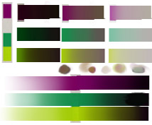
Light and colour in environment: working with colour from the start, trying to figure out how palettes work  - often one image relies on a low number of overall colors. Usually around 30mins to an hour each. I tend to either google these images or browse dA's photography sections.


Faces/people: a mix of greyscale and colour. usually any number of reasons for studying -  anatomy, light, form, colour. There are literally an infinite number of possibilities with faces. If I'm looking just at form I usually study busts as there's no colour to confuse. If i'm looking at overall body I often resort to lineowrk as it's much quicker and achievable in my lunch hour. These range from about 1-2hours for the colour/black and white, and 30 mins or so for each linework study. Sources include Conceptart's paint from what does everyone look like thread (in the lounge),  dA's stock section and googling for street fashion.


Monday, July 2, 2012

Art Exercise - drawing with white media

Ok, so this was not on my list of things to try, but it's an exercise I haven't done since art college days. It's not hugely exciting, or all that revolutionary, but it's dipping my toes back into the traditional media.Normally when I do pencil sketches I draw on white paper, yet when I work digitally I generally start with a grey or midtone background. Even then, I tend to start with a dark 'brush' and add highlights at the end.

So the goal of the exercise was to use white media exclusively on a dark surface. Lines weren't important, nor was shading, the idea was to just break out of the habit of going directly to a dark drawing medium. This was my end result (I wanted to use pen.... but it decided to dry up about 5 lines in *sigh* ... next time!)