Hey, everyone! If anyone is still reading this, I've made the decision to move this group to a Facebook group instead. It's just SO much easier to manage and share photos there than it is to post in this format.
I hope you will join me there! I took the liberty of inviting a few of you who I already know on Facebook who are also members here to join up there. If you're no longer interested in participating, that's fine too. I will not be offended if you remove yourselves!
Let's keep this thing going! It's so inspiring to be able to challenge each other and watch each other grow over time.:) See you there!
Facebook group link - https://www.facebook.com/groups/artistambition/
Monday, October 27, 2014
Thursday, August 1, 2013
Angela's Result - Using One Brush
So I tried Nicole's Using One Brush exercise and here is the result! The brush was the smeary square 69 brush that comes in the default 'square brushes' set in Photoshop. The result was a surprising amount of texture in the blending that reminds me quite a lot of oil painting!
I'm absolutely loving sketching like this since the texture of the brush does a lot of the work for you and makes the sketch look a little more varied and layered than if I'd used a pencil emulator or hard round. It forces you to be imprecise and to feel out your shapes with the eraser (which I also had set on the smeary square brush), which leaves a 'halo' of texture around your shapes which gives the image a nice subtle variance.
Definitely recommend trying it out for yourself! This is definitely going to be my go-to brush for quick concepting now.
Wednesday, June 19, 2013
Art Exercise - Master Copy
Hey guys! I just finished my first master copy and it was a very enlightening experience! I thought I'd post the exercise here for everyone's benefit.
A master copy is where you replicate a classical painting, thereby reverse engineering the techniques that they used to achieve a successful piece. If you're doing this digitally, like I did, here are a few ground rules.
1. NO tracing!
Hone your artist's eye for proportions by using a grid. Using this method also forces you to pay attention to the volume of objects in the image, rather than simply tracing the lines in a mechanical fashion. One way to do this is to set up a grid using Guides in Photoshop.
2. NO color fills!
Paint in the gradient of the first layer with brush strokes instead. Color fills just make the image look mechanical and plastic if you paint because the gradient is too perfect.
3. NO color picker!
Learn to eyeball color instead of using the color picker to pick them from the original. This is to force you to guess how it was mixed and be mindful of layering, as it's important to digital as well as traditional painting.
Here is my master copy as an example. I've blogged about what I learned here, if you're curious for a more in-depth look.


And a video link, if you can't see that GIF:
A master copy is where you replicate a classical painting, thereby reverse engineering the techniques that they used to achieve a successful piece. If you're doing this digitally, like I did, here are a few ground rules.
1. NO tracing!
Hone your artist's eye for proportions by using a grid. Using this method also forces you to pay attention to the volume of objects in the image, rather than simply tracing the lines in a mechanical fashion. One way to do this is to set up a grid using Guides in Photoshop.
2. NO color fills!
Paint in the gradient of the first layer with brush strokes instead. Color fills just make the image look mechanical and plastic if you paint because the gradient is too perfect.
3. NO color picker!
Learn to eyeball color instead of using the color picker to pick them from the original. This is to force you to guess how it was mixed and be mindful of layering, as it's important to digital as well as traditional painting.
Here is my master copy as an example. I've blogged about what I learned here, if you're curious for a more in-depth look.

And a video link, if you can't see that GIF:
Good luck and be sure to share your master copies here with us!
Thursday, November 22, 2012
Introducing Laurie Thomas

So not so much into editorial or concept art for realistic fantasy/ sci fi games. Since I'm doing the later so much in school, I hope to work on what I'd really love to do. I haven't done a comic in a while and already I'm forgetting about the rules of panel layout.
The area I mostly want to improve is composition and characters. To be specific, I would like to try new layouts for paneling and composing illustrations. I want to broaden my range for expressing character through poses and gestures.
Of course there's the things that we all want to work on, anatomy, perspective, lighting.... Anyway, Here's to all of us and our journey!
Tuesday, October 23, 2012
Complementary palette
Complementaries here being oranges and blues. For this project I wanted the eyes to pop a lot, so I used not only
the complementary blue to all that orange in the skin and hair, but I
also played with the lightness and saturation to make the eyes the focal
point. One more thing I tried to play with in this image was to use a
more textured skin, I’ve been trying to improve my skin tones, which I
think I am doing (though there is a long way to go still!) but so fat
I’ve never really been happy with the textures of my skin. This time it
looks a little better. I think there is a lot to improve and I hope to
some day find the delicate balance between subtlety and texture. As my
first try with this technique, I guess I’ll have to settle in order not
to neglect my other projects.
I might actually revisit the complementary colors topic. I actually envisioned something more eye catching. I can't stand the anatomy of the nose, that got messed up as I was painting it. I will need to do some nose studies, methinks.
 C&C are welcome!

Friday, July 27, 2012
Erin's Surrounded by Design exercises
Thanks to whoever first suggested the Surrounded by Design exercise - I had a lot of fun with these!
This weird flower:

Became this oddly camouflaged boat:


And this flower:

Reminded me of veins:

I'm one who has a lot of difficulty putting that first mark on paper, so this exercise was helpful.
Sunday, July 15, 2012
Restricted colour scheme
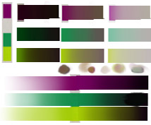
Hello again fellow ambitious peoples! I'm posting this one here now as a finished exercise. I took a cue from Coty's exercise and decided to limit myself to a 3 colour palette. Using some of the guidelines from the Dota2 character art pdf I've got this far with the image! It's now reached the point at which I really want to push it, and using just these three colours is holding me back, so you guys get it as is! Definitely a great exercise to show that colours relevant to each other can still look like stuff like skin, even if the colour on it's own would never look like it. Posting both the image and the palette I put together for it.


Subscribe to:
Posts (Atom)