Artist Ambition is a self-moderated joint blog for visual artists to improve their work through specific art exercises. Artists post exercise challenges and share the results. Results will be critiqued upon request of each artist.
So I tried Nicole's Using One Brush exercise and here is the result! The brush was the smeary square 69 brush that comes in the default 'square brushes' set in Photoshop. The result was a surprising amount of texture in the blending that reminds me quite a lot of oil painting!
I'm absolutely loving sketching like this since the texture of the brush does a lot of the work for you and makes the sketch look a little more varied and layered than if I'd used a pencil emulator or hard round. It forces you to be imprecise and to feel out your shapes with the eraser (which I also had set on the smeary square brush), which leaves a 'halo' of texture around your shapes which gives the image a nice subtle variance.
Definitely recommend trying it out for yourself! This is definitely going to be my go-to brush for quick concepting now.
Hey guys! I just finished my first master copy and it was a very enlightening experience! I thought I'd post the exercise here for everyone's benefit.
A master copy is where you replicate a classical painting, thereby reverse engineering the techniques that they used to achieve a successful piece. If you're doing this digitally, like I did, here are a few ground rules.
1. NO tracing!
Hone your artist's eye for proportions by using a grid. Using this method also forces you to pay attention to the volume of objects in the image, rather than simply tracing the lines in a mechanical fashion. One way to do this is to set up a grid using Guides in Photoshop.
2. NO color fills!
Paint in the gradient of the first layer with brush strokes instead. Color fills just make the image look mechanical and plastic if you paint because the gradient is too perfect.
3. NO color picker!
Learn to eyeball color instead of using the color picker to pick them from the original. This is to force you to guess how it was mixed and be mindful of layering, as it's important to digital as well as traditional painting.
Here is my master copy as an example. I've blogged about what I learned here, if you're curious for a more in-depth look.
And a video link, if you can't see that GIF:
Good luck and be sure to share your master copies here with us!
I did a few more tries of the Surrounded by Design exercise (where you take random photos and create characters or environments from them). I can tell that this exercise is really striking at two weak points of mine - environments and atmospheric lighting. It was very difficult for me to come up with interesting compositions when there weren't human figures involved and to light them accurately so there was a sense of depth.
It just goes to show that I need to start thinking of my environments like I do my characters by thinking of a narrative for them. What is this place used for? What is its symbolic meaning? What can I add to them that creates visual interest? How can I arrange my environment so it has an interesting composition? This was a really great exercise. I hope others will try it and share as well!
The original photo rotated and cropped.
The result - some kind of secret underground shrine.
The original photo of a bird feeder turned upside down.
Bird feeder equals KILLER SPACE CANNON!
Photo of origami cranes turned upside down.
Equals alien mirror pyramids in the desert!
I think the next exercises I need to do to help my environments and lighting are studies of photos. Not so much creating environments as copying existing photos to get a better sense of lighting and color, then moving on to creating my own environments (suggested exercise of 30 thumbnails).
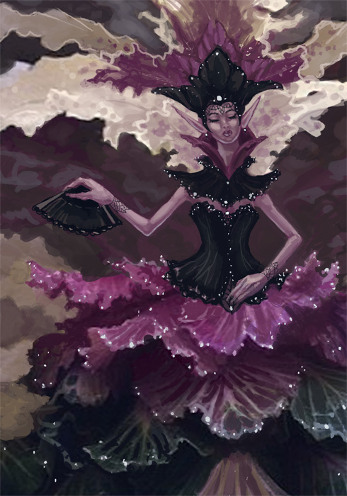
The layered leaves with the color shifting areas caught my eye first. I immediately thought of the ruffles of a dress. The curled leaves in the top right also made me think of underwater kelp. Dress ruffles won out, however, after arranging parts of this photo ended up with the white fronds looking like an Elizabethan collar.
I'm rather excited by the result! This image went by much faster than my other digital pieces because I had a base for the texture. It could still use some touching up, but I'm otherwise pleased with the spontaneity of coming up with ideas this way!
CRIT PLZ: Her arms feel bare to me. Should I add something more to them? More filigree armbands? Should I add more to the background or does the ambiguous patterns work? Anything else I can do to make this more interesting, should I spruce it up for a portfolio piece?
I hope others try this exercise. It was tons of fun! It's a bit like an artist's Rorschach test. What do YOU see in that shape?
My name is Angela Sasser and I consider myself to be a fantasy artist. My favorite topics are myths, fairy tales, gods, goddesses, elves, rogues, and warriors, among other things. My ultimate career goal is to end up as an illustrator for card art, rpg books, and book covers. I would love to get involved in doing character and concept art for video games as well!
I am a traditionally trained painter with a classical education a la 'paint your feelings on canvas', but that path never suited me. Too in love with Elves!♥ I'm currently trying to expand beyond my watercolor and ink roots into digital painting and it's been a tough road for me. I would ultimately like to be able to create digital paintings that replicate the energy of my traditional paintings.
Here are the list of the things I wish to improve on with a few of the areas I'm hoping to challenge myself with. I still need to think of some specific exercises to do with some of these. I'll be adding more as I think of them and will keep this list here for my own benefit.
Anatomy:
Draw 100 Hands and Feet
Draw 100 Torsos
Draw 100 Mancrotches
Various Expressions
Various Ethnicities
Composition:
Group of people
Action scene
Book cover
Concept Art:
Storyboarding - Favorite Scene from a Book
Character Design:
Fashion templates
100 Faces
Orthographic Sheets
Environments:
Narrative locales from a favorite book