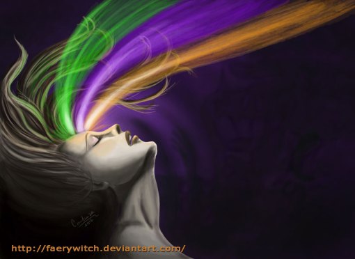
I have had in mind for a while this image and I decided to work with a secondary palette: Green, violet and orange. It really proved to be harder than what I originally thought, and I don’t know how well I did honor the secondary theme, but the final image has the energy I was looking for.
Comments and critiques, always welcome!

That puts my list down by two themes! Yay!
Palettes:
Monochrome
Complementary
Primary
Tertiary
Split complementary
Analogous
Multicolor
Warm
Cold
Composition:
Pyramidal
Spiral
Big group of people
Architecture
one point perspective
two points perspective
It's been interesting seeing how this piece has evolved from start to finish, Coty. The base idea is really fun and I think that you could push this even further!
ReplyDeleteI wonder if you could go as far as to add some kind of barely discernible scene or painting inside each of the color swaths? I think this would help get across the idea that there is an 'ex nihilo' transformation going on, something coming from nothing. Right now, it reads to me more of simple beams of light, but I don't quite understand the significance of these lights, other than to create an interesting composition, which is fine, but can be pushed further, if you wanted to spend a little more time on this piece.
Also, I find the composition has great flow, but is a little imbalanced, as far as there is a space on the bottom right of dark color that is overpowering the piece. Perhaps you can fill this space with more visible abstract texture so that this darkness is not so overpowering? You could perhaps accentuate more of the radiating lines you already have in the background to emphasize that visual vibration this piece already has. You could perhaps even add little pinpricks of stars, hinting at the void of creation around her.
Finally, this is a bit of a knitpick for me, but I still find the curled ends of her hair distracting. They interrupt the diagonal flow when I feel like they should more subtly fade into the colors as if they were a part of the colors, themselves. The curling ends trip up the flow of the eye as they are being carried off the page. Or if you want to keep some of that curl so it is apparent she has solid physical hair, you can have it fade from the curling tips into some of the longer straight hairs towards the bottom joining completely with the swaths of color gradually.
Hope that all made sense! I look forward to seeing how you tackle the next color schemes on your list.:)
Ang has some valid points, although I'm tempted to say that the purple swirl you have by the head in the background counters the eye's need to go wandering off to the top. I love the subtle figures in the background too! I think the head's really well rendered and the bursts of colour emanating from the forehead look great. If I'd say anything it would have been that I'd have loved to have seen you use those three colours actually in the palette for her skin - I could see a really desaturated green as the overall hue, and using the oranges as the regular 'pinks' (end of nose, cheeks etc) and the purples as the cooler areas or shadows... but overall I'd say it seems like a successful exercise!
ReplyDelete